Billboard

The title (which is also a logo) is placed directly in the centre of the billboard to grab the viewers attention- this could give the audience a sense of recognition. Also directly below the logo/title, an image of Riz Ahmed's character ''Aaron'' is displayed to suggest that he is the main character in the movie, who plays a significant role in the lives of the other characters as well. Therefore the design is quite clever and suitable to the narrative as it suggests that the character of ''Aaron'' is the root of all the other narratives.
At the top of the billboard there are two reviews,that give ''iLL Manors'' a 4 star rating. This helps the viewer understand how good the movie is- allowing the audience to make a judgement on whether or not they should see the film. The reviews also use the words ''incredible'' and '' fantastic'' to have a similar effect on the viewer.
The use of bright colours and a striking design, would grab the viewers attention and therefore fulfil its purpose as a billboard.
The use of bright colours and a striking design, would grab the viewers attention and therefore fulfil its purpose as a billboard.
The title acts as a logo as the typography cleverly depicts ''tower/estate blocks''. The letter ''i'' is also in the lower case form, in all prints. Also, the estates in the background (with the same colour scheme) , are seen on the DVD packaging for the film.
What examples of synergy can you find with the broadcast platform or other print examples?
On most of the prints, Riz Ahmed's character, Aaron, is positioned in the centre, to show his importance. Also the billboard shows all of the characters, even those who play a small part in the story, e.g Jody who plays Ed's sister in the film. This is similar to the appearance of insignificant characters in the trailer.
DVD Cover
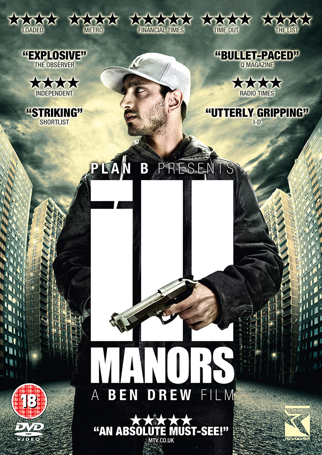
What are the key conventions that help you identify the print text (e.g. title, central image, review quotes etc.)?
At the top of the DVD cover there are also reviews to inform the audience on how good the film is. There are more ratings on the DVD cover than on the billboard as the viewers have more time to look at the packaging and judge whether or no they would like to see the film.
Furthermore, there is an age rating to show audiences that the film has some graphic content e.g sex scenes, the use of drugs and violence/torture.
What design features help identify the Ill Manors brand?
The logo is a common feature on all prints of the ILL Manors brand. The ''tower block'' typography is similar to the image of tower blocks behind Aaron's character.
What examples of synergy can you find with the broadcast platform or other print examples?
The character of Aaron is placed in the centre in the billboard advert as well.
CD Cover

What are the key conventions that help you identify the print text (e.g. title, central image, review quotes etc.)?
For this print text, Plan B's image is used instead as it is his soundtrack. The typography of the title has slightly changed to fit the theme of the soundtrack- the word '' Manors'' is displayed as graffiti on the wall that Plan B is sitting on. This vandalism connotes some of the main themes of the soundtrack e.g crime and rebellion. However the placement of the title remains unchanged( it is still displayed in the centre to grab the viewers attention).
It also includes a small summary of some of his biggest hits e.g ''ILL Manors'' and ''Lost My Way'', to show his fans what songs will be featured on the soundtrack. Also his name is written as a logo to create a sense of identification within his fan base.
Finally, the use of the ''parental advisory'' sticker allows the audience to recognise that it is a CD cover.
What design features help identify the Ill Manors brand?
In the background there are estates,which are common on most print texts.
What examples of synergy can you find with the broadcast platform or other print examples?
In the background there are estates,which are common on most print texts.
What examples of synergy can you find with the broadcast platform or other print examples?
The CD cover mentions the main song for the film ''iLL Manors'' which is barely mentioned in other print texts. It is however mentioned and shown in the TEDx lecture.
No comments:
Post a Comment